

Rethinking online classifieds
Challenging Craigslist through clarity
Klaza was an early-stage startup dedicated to a better classifieds experience for shoppers and sellers.
At the time, Craigslist was the go-to classifieds platform but its experience overloaded shoppers with information and often left them struggling to find what mattered.
Role
Product strategy
Product design
Front-end development
Team
1 Product Designer
2 Engineers
1 Research assistant
Reducing noise while increasing flexibility
Presenting a lot of information and offering advanced features can be valuable but often forces users to work harder before they can act.
With Klaza I explored a different balance: reduce the amount of information users need to process at a glance without limiting access to the full dataset.
Craigslist as precedent
A proven but mentally demanding interface
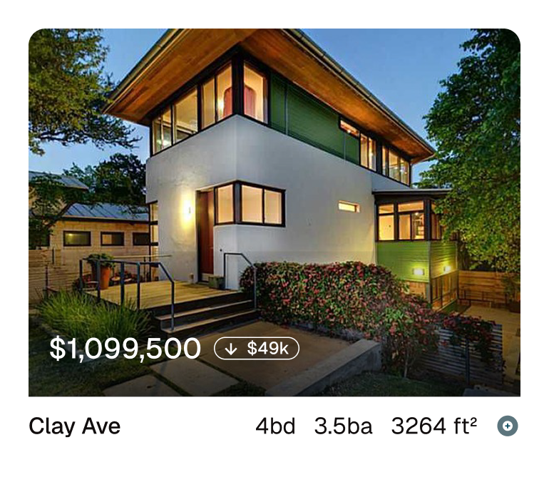
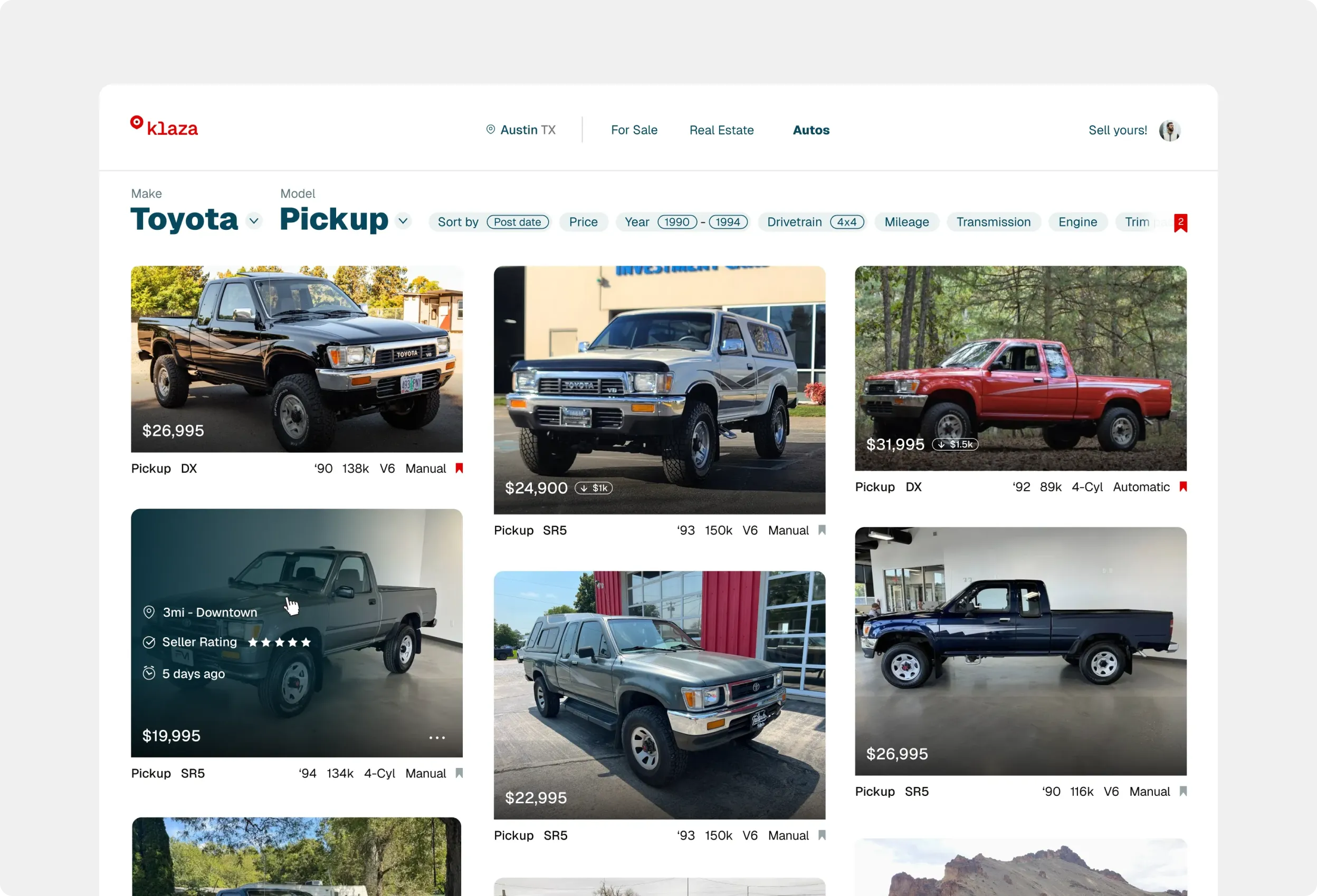
The right information in the right place
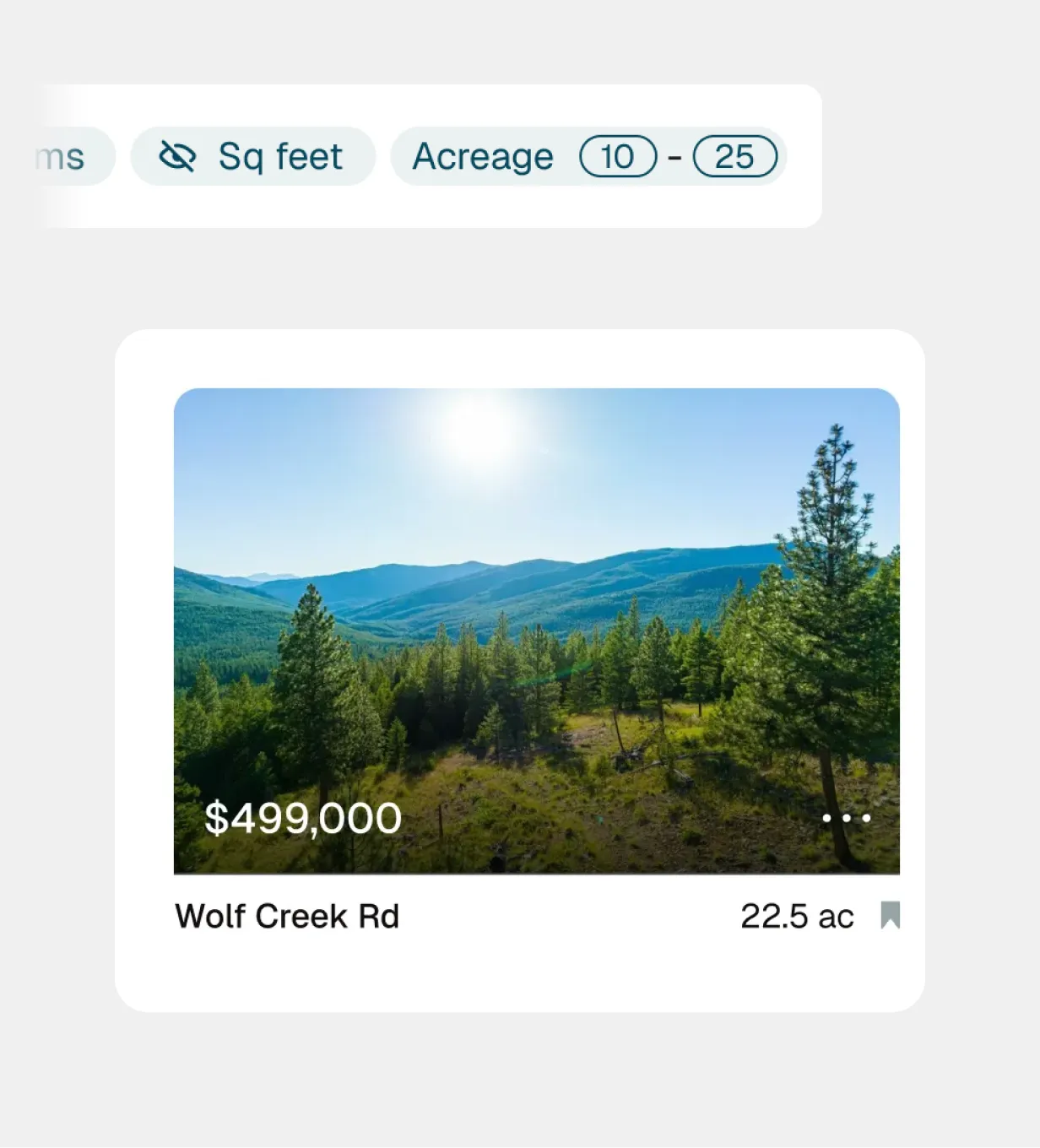
Listing cards feature decision-relevant details by default. Additional customization is available through filters.
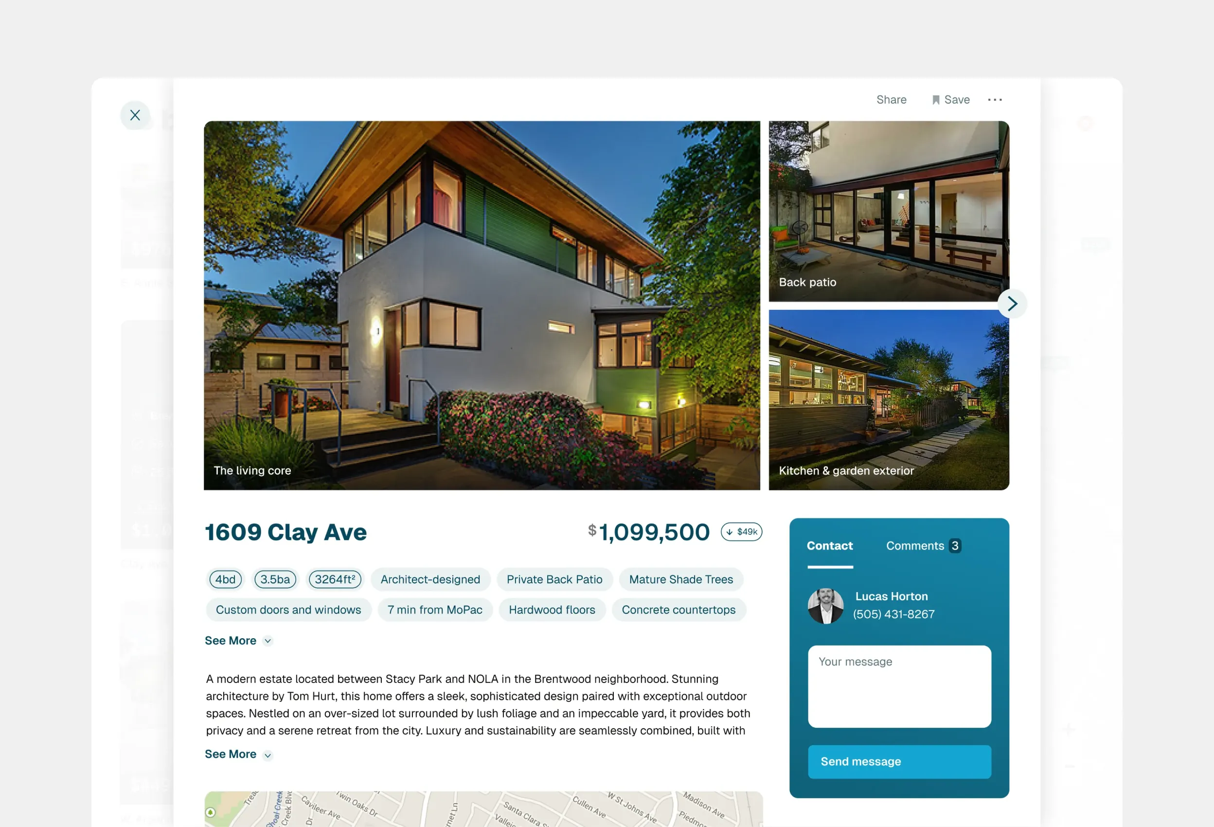
The listing modal
Data types are kept generalized but can be specified enough to support scanning and a deeper look
Key decisions
After leading the team through the discovery process, three strategies stood out:
Simplify listing cards
Listing details were reduced to the most decision-relevant information so users can compare results with less cognitive load.

Control through filtering
Users shape the search around what matters to them by setting the attributes displayed in each listing.
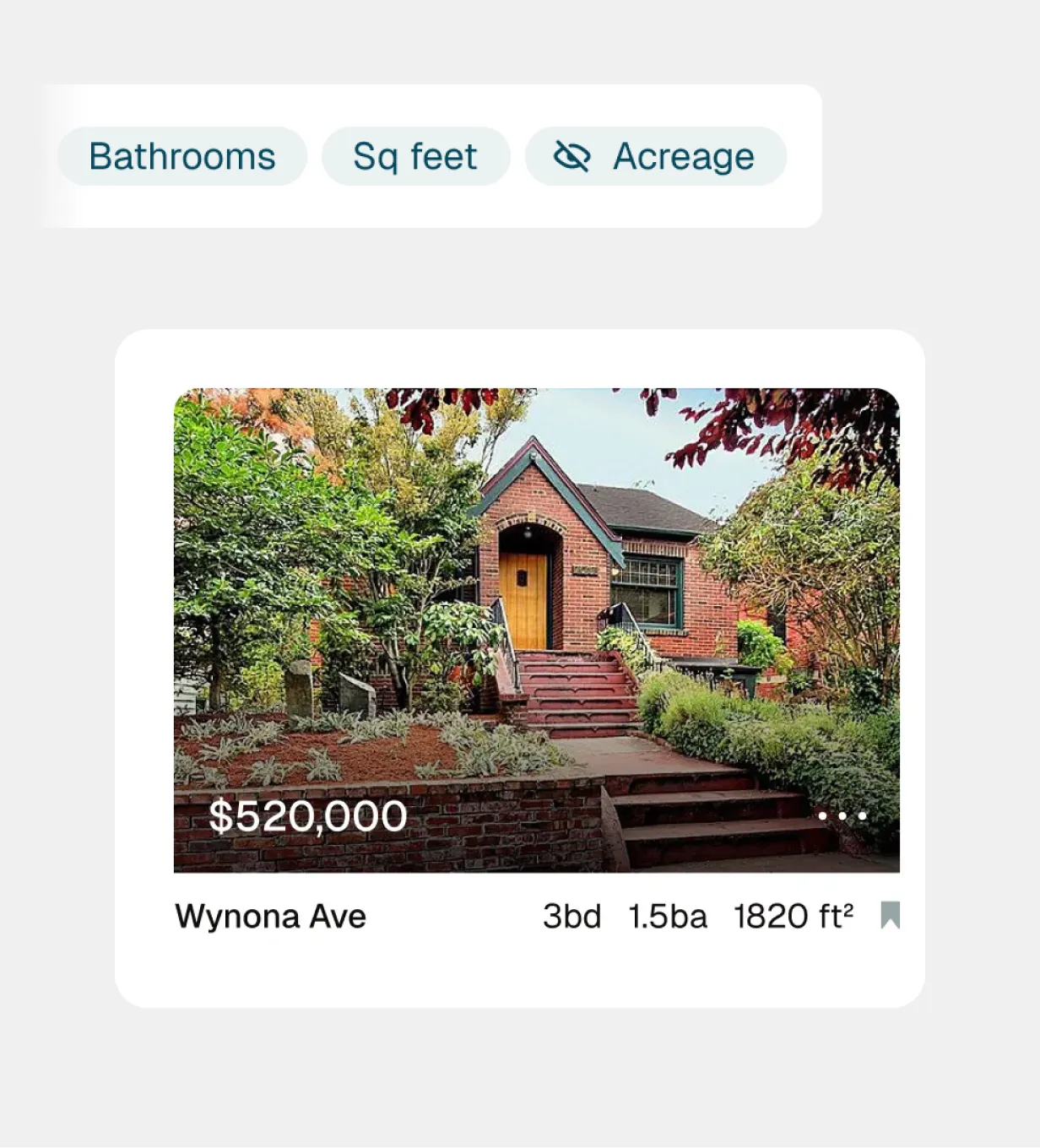
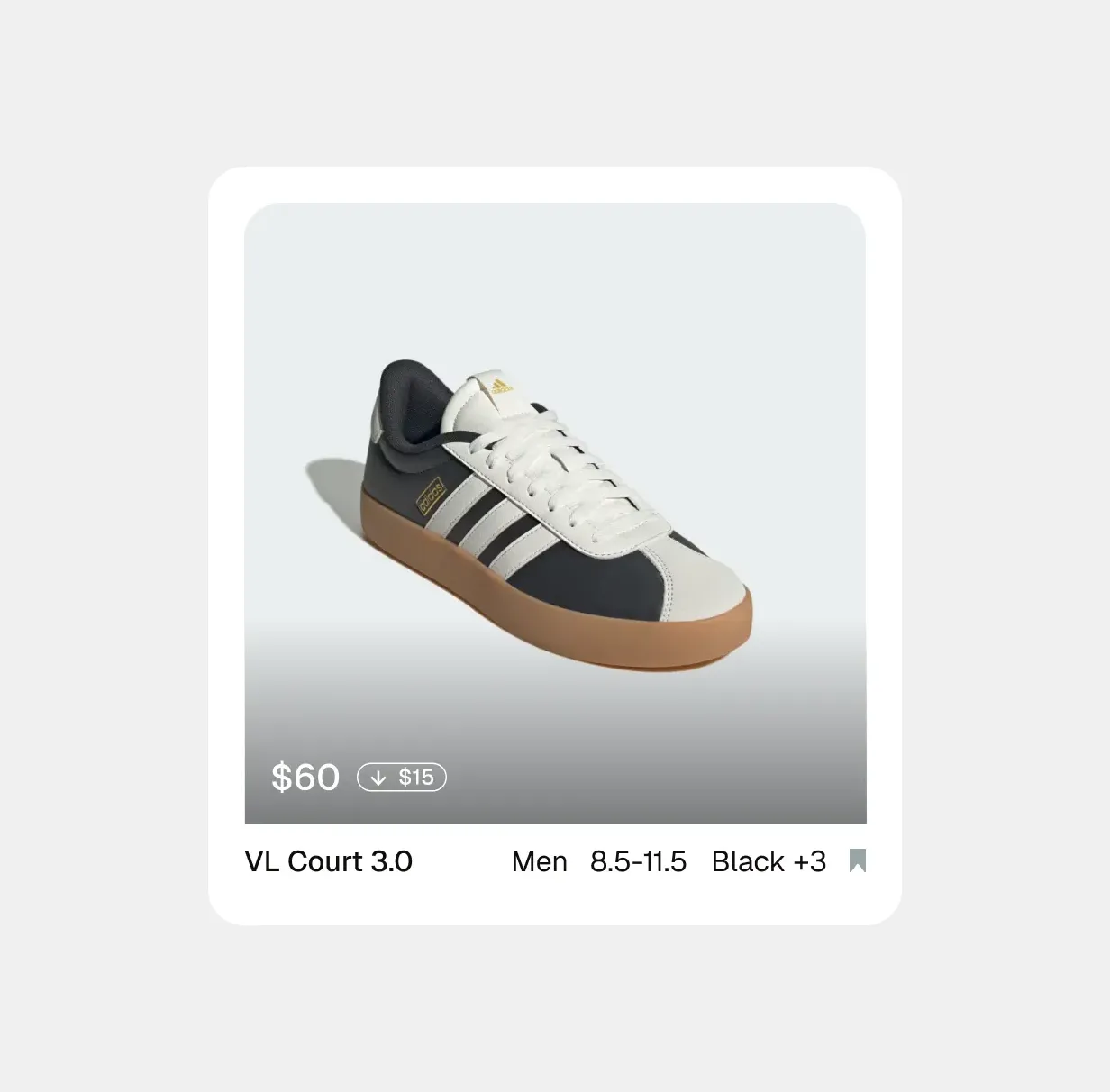
Adapt the interface to the context
Listing cards feature decision-relevant details by default. Additional customization is available through filters.

Outcome
Development delays ultimately stalled the project before it could be completed.
However, the core interface concepts were developed and partially implemented. I built the front-end for the initial version and that work was used as the foundation for the production build.
The project clarified a central idea I’ve continued to apply: making complex systems easier to use is often less about adding features and more about reducing what users need to process at any given moment.
More work
TesserConnecting DIYers with experts

Lifted LED Designing grow-light controls
We MakeA human scale social medium

From my profile
As a designer, it’s inspiring to meet people where they are. Read more
Rethinking online classifieds
Challenging Craigslist through clarity
Klaza was an early-stage startup dedicated to a better classifieds experience for shoppers and sellers.
At the time, Craigslist was the go-to classifieds platform but its experience overloaded shoppers with information and often left them struggling to find what mattered.
Role
Product strategy
Product design
Front-end development
Team
1 Product Designer
2 Engineers
1 Research assistant
Reducing noise while increasing flexibility
Presenting a lot of information and offering advanced features can be valuable but often forces users to work harder before they can act.
With Klaza I explored a different balance: reduce the amount of information users need to process at a glance without limiting access to the full dataset.
Craigslist as precedent
A proven but mentally demanding interface
The right information in the right place
Listing cards feature decision-relevant details by default. Additional customization is available through filters.
The listing modal
Data types are kept generalized but can be specified enough to support scanning and a deeper look
Key decisions
After leading the team through the discovery process, three strategies stood out:
Simplify listing cards
Listing details were reduced to the most decision-relevant information so users can compare results with less cognitive load.
Control through filtering
Users shape the search around what matters to them by setting the attributes displayed in each listing.
Adapt the interface to the context
Listing cards feature decision-relevant details by default. Additional customization is available through filters.
Outcome
Development delays ultimately stalled the project before it could be completed.
However, the core interface concepts were developed and partially implemented. I built the front-end for the initial version and that work was used as the foundation for the production build.
The project clarified a central idea I’ve continued to apply: making complex systems easier to use is often less about adding features and more about reducing what users need to process at any given moment.
More work
Tesser
Lifted LED
We Make
From my profile
As a designer, it’s inspiring to meet people where they are. Read more
Rethinking online classifieds
Challenging Craigslist through clarity
Klaza was an early-stage startup dedicated to a better classifieds experience for shoppers and sellers.
At the time, Craigslist was the go-to classifieds platform but its experience overloaded shoppers with information and often left them struggling to find what mattered.
Role
Product strategy
Product design
Front-end development
Team
1 Product Designer
2 Engineers
1 Research assistant
Reducing noise while increasing flexibility
Presenting a lot of information and offering advanced features can be valuable but often forces users to work harder before they can act.
With Klaza I explored a different balance: reduce the amount of information users need to process at a glance without limiting access to the full dataset.
Craigslist as precedent
A proven but mentally demanding interface
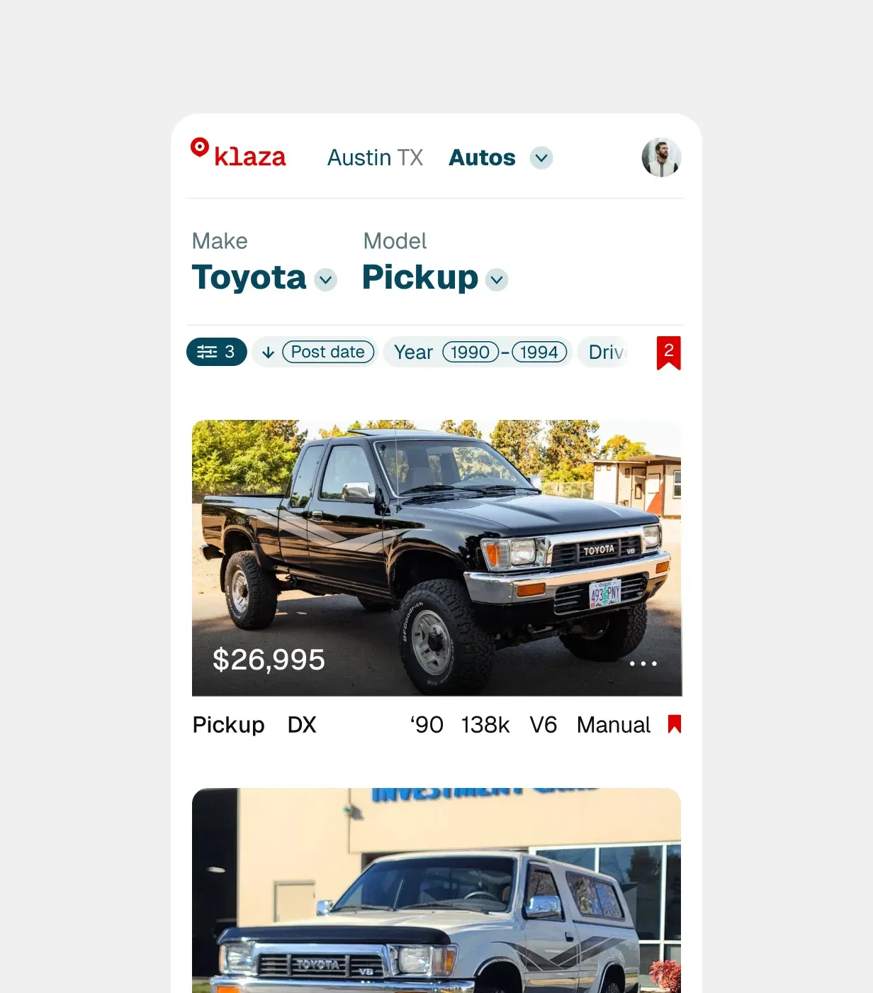
The right information in the right place
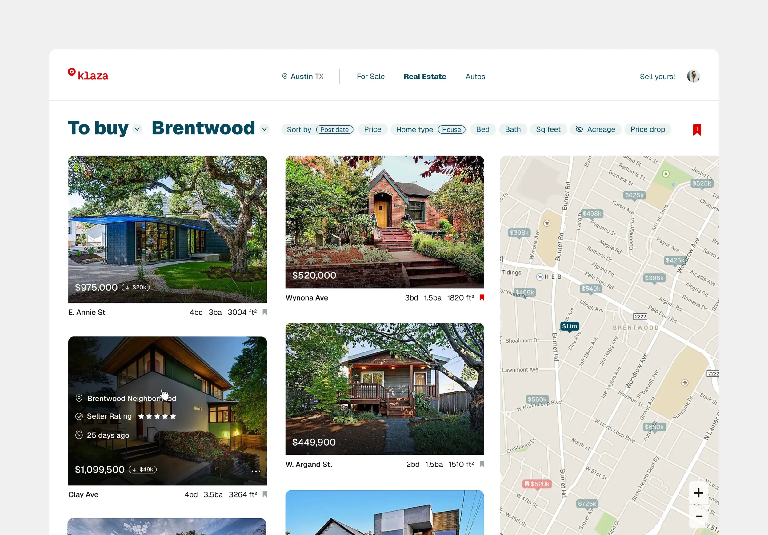
Listing cards feature decision-relevant details by default. Additional customization is available through filters.
The listing modal
Data types are kept generalized but can be specified enough to support scanning and a deeper look
Key decisions
After leading the team through the discovery process, three strategies stood out:
Simplify listing cards
Listing details were reduced to the most decision-relevant information so users can compare results with less cognitive load.
Control through filtering
Users shape the search around what matters to them by setting the attributes displayed in each listing.
Adapt the interface to the context
Listing cards feature decision-relevant details by default. Additional customization is available through filters.
Outcome
Development delays ultimately stalled the project before it could be completed.
However, the core interface concepts were developed and partially implemented. I built the front-end for the initial version and that work was used as the foundation for the production build.
The project clarified a central idea I’ve continued to apply: making complex systems easier to use is often less about adding features and more about reducing what users need to process at any given moment.
More work
Tesser Connecting DIYers and experts
Lifted LED Mobile grow light controls
We MakeA human scale social medium
From my profile
As a designer, it’s inspiring to meet people where they are. Read more
Rethinking online classifieds
Challenging Craigslist through clarity
Klaza was an early-stage startup dedicated to a better classifieds experience for shoppers and sellers.
At the time, Craigslist was the go-to classifieds platform but its interface overloaded shoppers with information and often left them struggling to find what mattered.
Role
Product strategy
Product design
Front-end development
Team
1 Product Designer
2 Engineers
1 Research assistant
Reducing noise while increasing flexibility
Presenting a lot of information and offering advanced features can be valuable but often forces users to work harder before they can act.
With Klaza I explored a different balance: reduce the amount of information users need to process at a glance without limiting access to the full dataset.
Craigslist as precedent
A proven but mentally demanding interface
The right information in the right place
Listing cards feature decision-relevant details by default. Additional customization is available through filters.
The listing modal
Data types are kept generalized but can be specified enough to support scanning and a deeper look
Key decisions
After leading the team through the discovery process, three strategies stood out:
Simplify listing cards
Listing details were reduced to the most decision-relevant information so users can compare results with less cognitive load.
Control through filtering
Users shape the search around what matters to them by setting the attributes displayed in each listing.
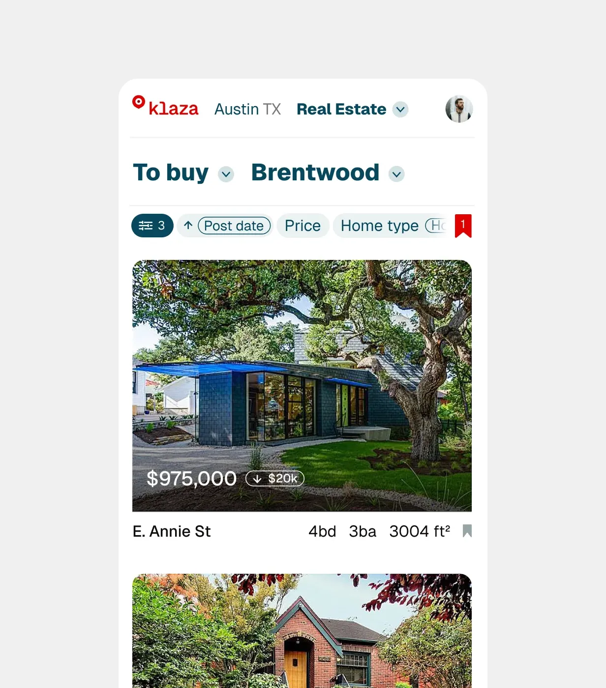
Adapt the interface to the context
Each category surfaces the most relevant information such as a map-based view in Real Estate or a Material filter in product searches (when appropriate).
Outcome
Development delays ultimately stalled the project before it could be completed.
However, the core interface concepts were developed and partially implemented. I built the front-end for the initial version and that work was used as the foundation for the production build.
The project clarified a central idea I’ve continued to apply: making complex systems easier to use is often less about adding features and more about reducing what users need to process at any given moment.
More work
Tesser Connecting DIYers and experts
Lifted LED Mobile grow-light controls
We Make A human scale social medium
From my profile
As a designer, it’s inspiring to meet people where they are. Read more